UX/ UI/ Information design/ E-commerce
Growth Design: Optimizing a core user flow to drive a 30% increase in sales
When the founders of Vela approached me, their e-commerce site needed a revamp. They wanted to enhance the user experience, guiding customers effortlessly towards completing purchases. Faced with a looming launch deadline, we focused on high-traffic areas initially and deferred the complete site overhaul for later stages.
Figma
Shopify
Adobe
Tools used
Timeline
2 Months
Leadership
Marketing
Developer
My Role
User experience
Interface design
Information Design
Site Optimization
Team
We needed to harmonize the site's theme, simplify the shopping process, and provide essential information without overwhelming the consumer.
The Challenge
We streamlined the navigation menu, product pages, and search bar, aiming to craft an inviting user experience. Our objective was to balance information accessibility with intuitive design, ensuring seamless interaction.
The Solution
Defining the Problem
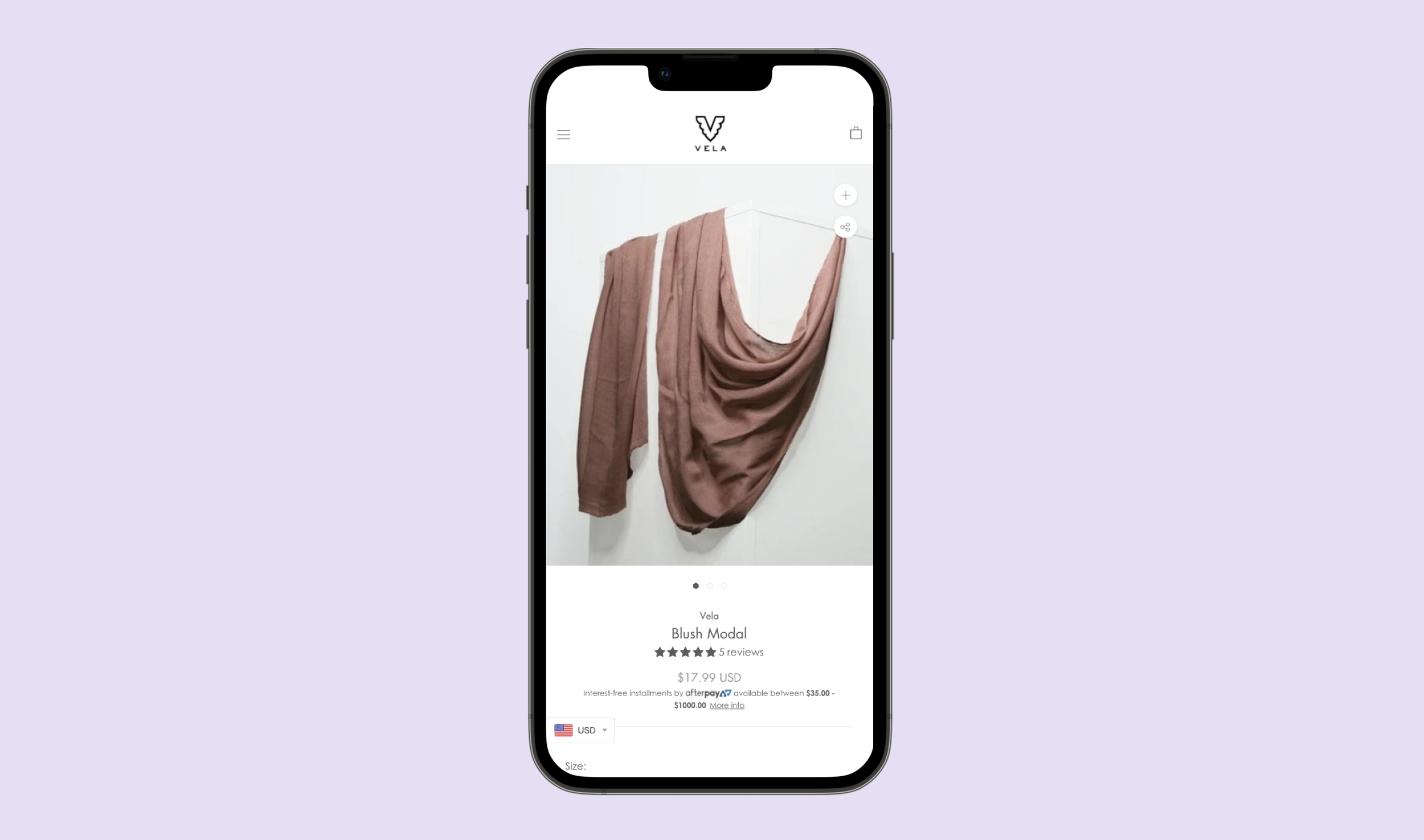
before
Through some initial research of the site and the competitors as well as speaking to the companies marketing strategist, I found that the consumers weren’t getting all the info they needed before the fold which meant they had to scroll though the site longer to find what they needed. The navigation menu was also not as clear. This is a scarf based company and consumers were still having to search “scarves” in the search bar to find items. This leads to a lot of lost sales and the consumer is left with a bad shopping experience. Let’s take a look at the site before the changes below to better understand the problem. Starting with the product page;
Things that stick out as you scroll through the product page are:
Too much negative space
Poor contrasting on call to action buttons
Product information is too long and spread out
Titles aren’t strong and clear
As I went through the drop down navigation here were somethings I noticed.
Poor information architecture
Poor use of space
No clear navigation to products and product types
By taking what stuck out most and what wasn’t working I was able to move to the sketching phase.
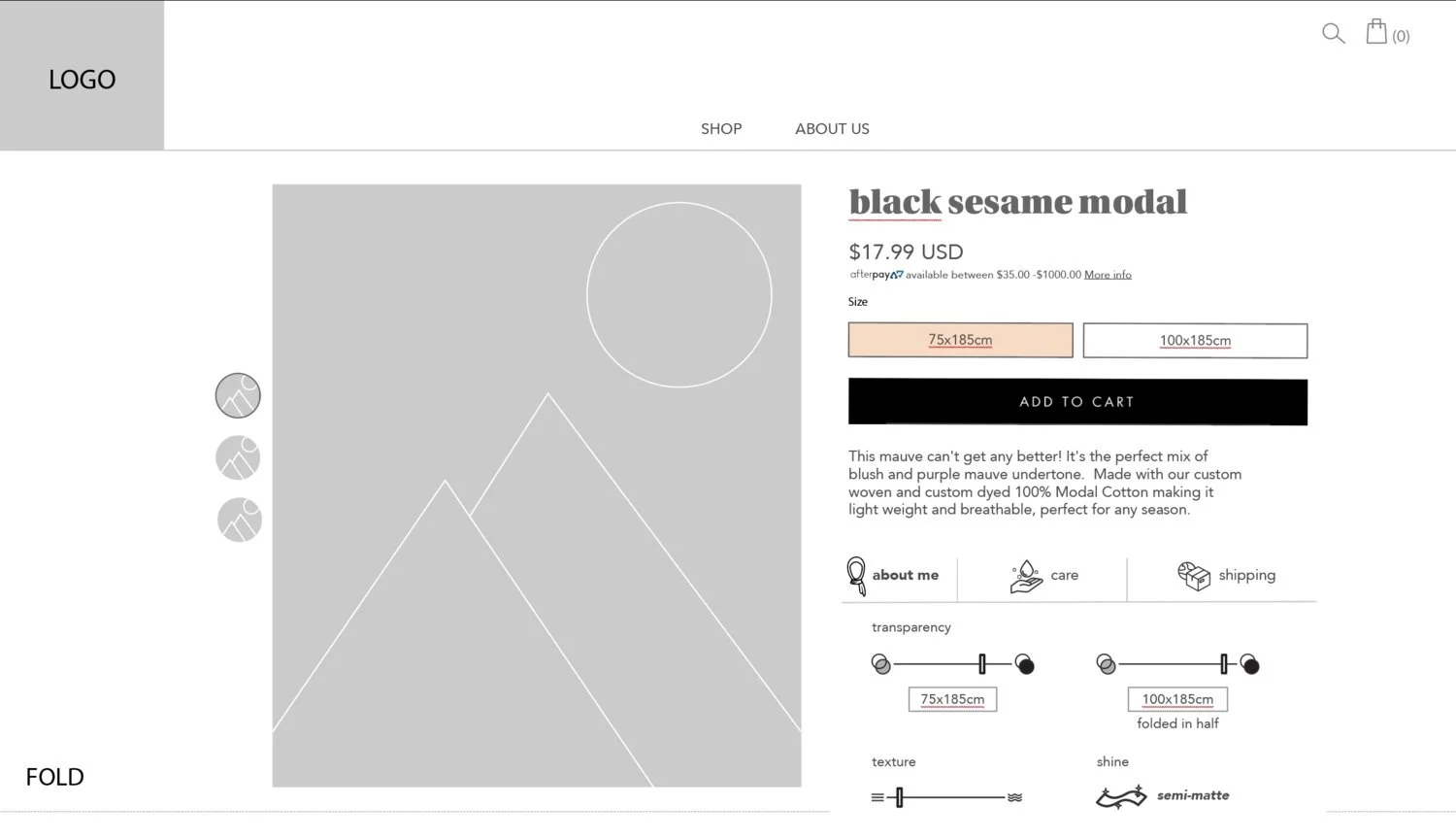
Incorporating user and company perspectives, I sketched two versions for the founders. One version showcased all necessary information without requiring scrolling, aided by custom icons, enhancing clarity and contrast in call-to-action buttons. These changes empowered users, enabling faster decisions and more control over their shopping journey.
Iterations
Navigation Map
I crafted a site map that organized main products and popular collections, guiding users directly to their desired destinations. This strategic navigation aimed to reduce friction and reliance on the search bar.
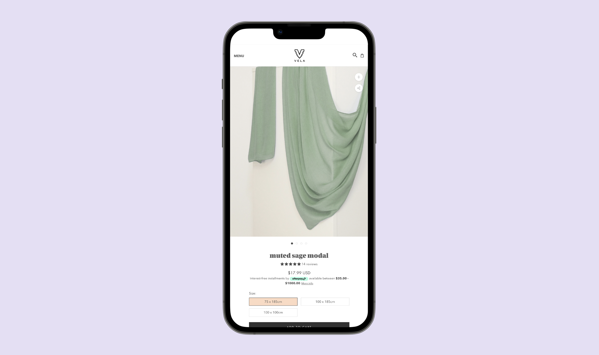
Upon approval, we brought the redesigned site to life, featuring a revamped navigation menu, info tabs with design icons for reduced scrolling, accessible call-to-action buttons, and an updated search bar. Cohesive branding and efficient space utilization further enhanced the user experience. Mobile menus were streamlined for quick access, ensuring seamless navigation.
Key updates to the site:
Navigation Menu
Product page Info tabs and design icons for less scrolling
Call to action buttons are more accessible
Product images have preview thumbnails
Titles and Branding on the site are more cohesive
Overall the site has a more efficient use of space
Search bar was updated from full screen to a side panel
Mobile Menu bars were changed to “Menu” for quick access
Prototype
Final Design
Despite the challenges posed by the peak of the Covid pandemic, we successfully launched the site. Post-launch adjustments were minimal, leading to a remarkable 30% increase in sales. Positive feedback flooded in, especially regarding the new icons. The founders were delighted, and user complaints reduced significantly.
Summary
The company didn’t have a budget or time to do any user testing as this is something I really wanted to do to make sure we were making the site the best it could be for the users. Other changes would be adding images to show product transparency and videos showing the products in motion on each product page to help customer make their decision without actually touching the product.
Next Steps
New Vela scarves website updates will be presented in interview stages
work
